Main Course 2

Graphics & Image Processing

Typography

Graphic Design

Graphic Production Apprehension

Layers:

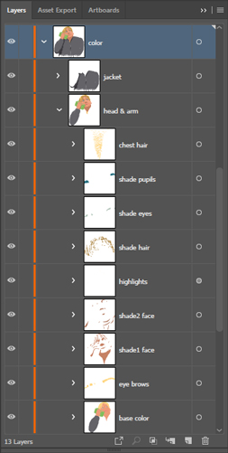
I sorted the different elements with layers, and then I even sorted the elements' content by groups.
I made the document so organized because it was a redesign, and by doing that, I would always know where to look for specific elements, new or old, stroke or fill and so on.

Redesign:

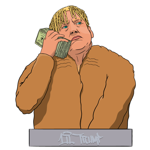
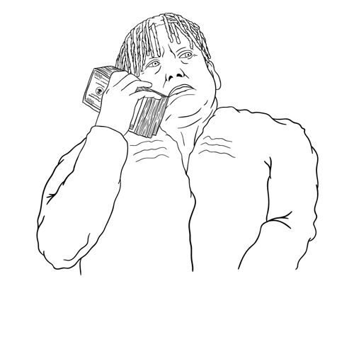
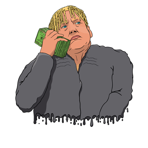
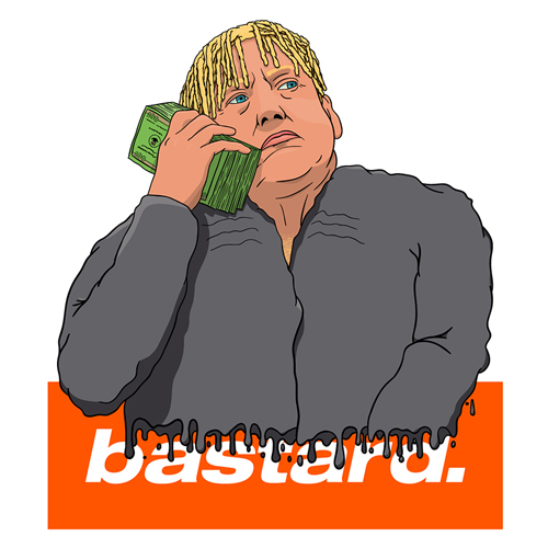
The original design is something that I had already made. I thought it would be a really good fit on a t-shirt in the bastard shop.
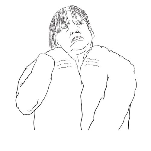
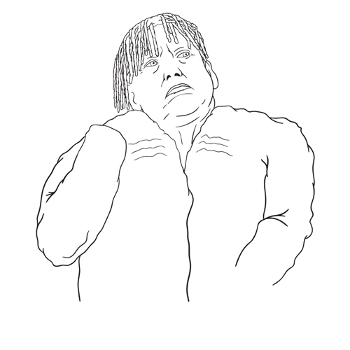
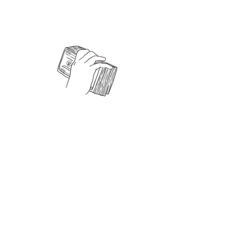
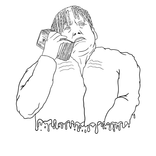
For the redesign I started out by hiding everything except the outline. And with nothing but the outline, I deleted his right arm and the 'Lil Trump' pedestal thingy. Then I could redraw the arm and add a melting bottom. I converted the new outline to a shape, and then I could start fixing the color shapes.

Recolor:

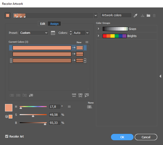
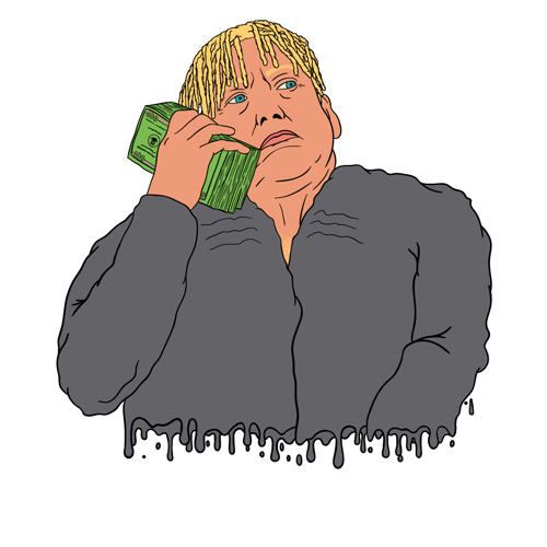
Because of my layer structure, it was very easy to recolor the artwork. I would select some similar colors, to not get overwhelmed when adjusting them, and then I changed them via Edit > Edit Colors > Recolor Artwork...
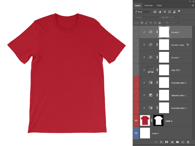
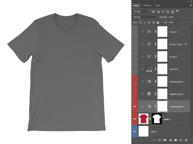
Image Extration:

The first step was to remove the background. It wasn't completely nescessary in this case, but in other scenarios the background usually isn't plain white.

Color Adjustments:

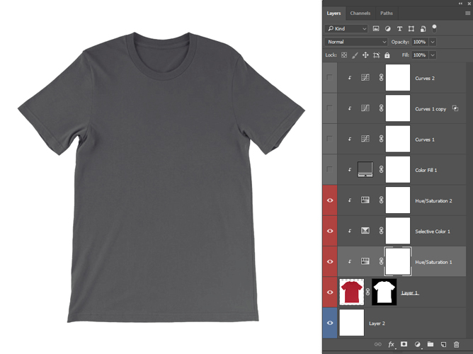
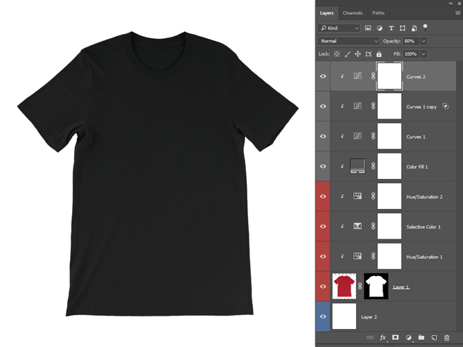
Adjusting the colors was the biggest challenge in this assignment. For the black t-shirt I removed colors with Hue/Saturation and added some vague blue tints to bring it back to life. Darkening the t-shirt was a longer process, involving making it a little darker with 'lightness' in Hue/Saturation, using Color Fill with the blending mode set to multiply.
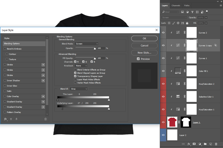
By then it was just dark, so I still had some lighting to bring back, and I did that with two Curves layers. In the first one I brought back some lightness in the shirt, and highlights in the second. To not ruin the dark colors, I set the blending mode to screen and made adjustments in Layer Style > Blending Options > Blend If: Gray > Underlying Layer. I used the last curve layer to make it slightly darker, which brought me the satisfaction I had longed after.

Merging:

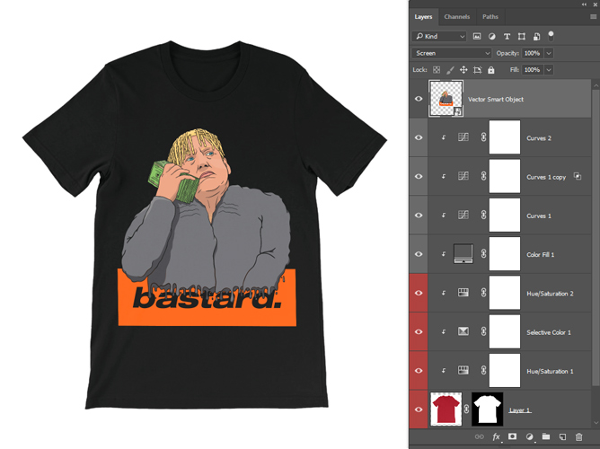
The merge was rather simple, because I made the document ready for mass production of product pictures. Pretty much the only thing that was required of me at this point, was to set the design's blending mode to screen, so the shirt's shading could be seen through it.
At other times the shirt might have folds where the design is supposed to be, and it that case I would have to warp part of the design to flow along with the surface of the shirt. The shading in the design on the shirt would also be more noticable if that was the case.