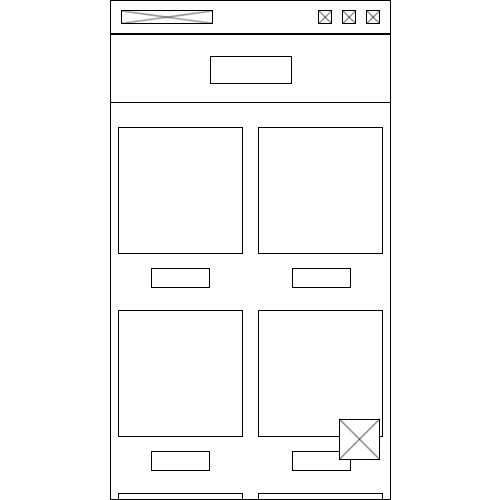
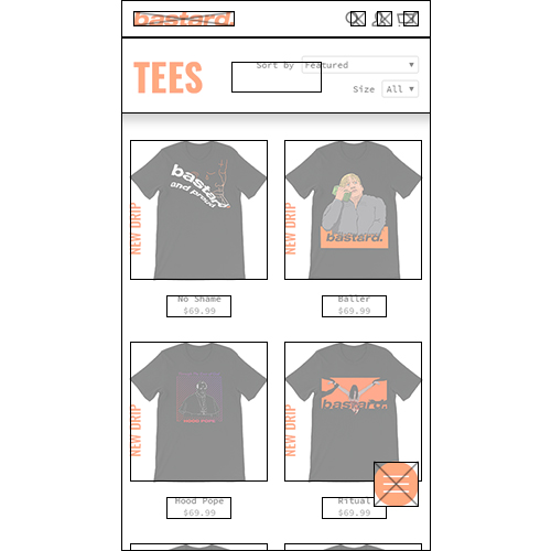
While designing the interface, I put emphasis on the rule 'mobile first' due to it being important for a website whose target group is the youth. I think the usage of the orange color fits well without being excessive. The black/gray on white and a balanced amount of space leaves it looking clean and intelligible.
Customer Description:
Bastard is an up and coming clothing brand. They have a large collection of trendy clothing that features comedic, dark and controversial prints.
Logo:
For the logo I decided to make a logotype. I have selected Helvetica Neue LT Std '83 Heavy Extended Oblique'. I believe it is suitable due to the font being big and crisp whilst being deliberate and humble with the lower-case lettering. The period creates a balance due to the text being oblique, however it also adds something to the humbleness, along with the lines of ‘this is it, and nothing more’.
Brainstorm & Inspiration:
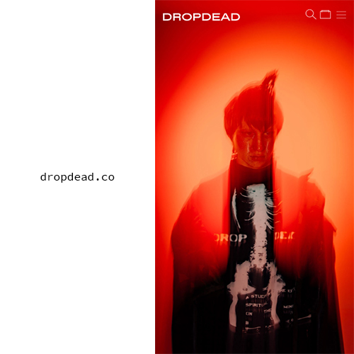
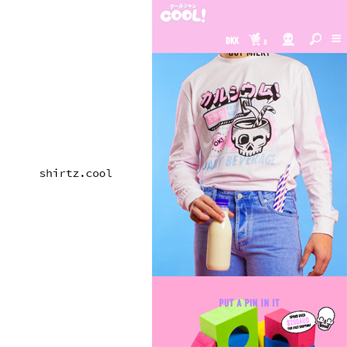
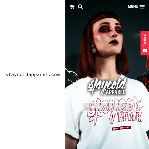
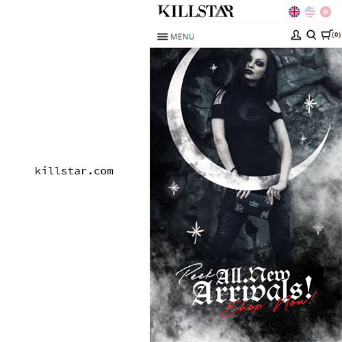
This ‘brainstorm’ is from after I eliminated the things that I feel should not be associated with the brand. I have been inspired by some web shops that I feel roughly hit the same target group as me. It should also give you a good idea of where I want to go with ‘bastard’.
Colors:
I selected the orange color as it expresses a great deal; including heat, joy and energy. However, it can also express warning, fire and danger which I feel fits the brand. In addition to the standard black and white you see on the website, I have selected two grayscale colors. I used these grayscale colors in places that don’t need to be emphasized as much.
Bonus:
The burger menu has a fixed position, 60 pixels above the bottom on the right-hand side, which is very user-friendly for right-handed users on mobile. When the footer is visible, the burger menu hovers 60 pixels above it, so it doesn't conceal any links you might want to access in the footer.
The arrows that have been used for dropdowns and such, are a part of the font. I think they stand out and look good with the monospace font.
▼ = ▼, ▶ =
▶ and ◀ = ◀