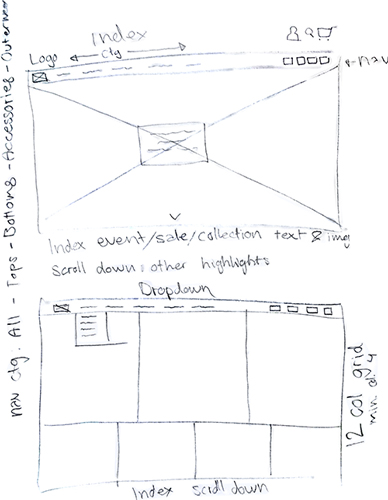
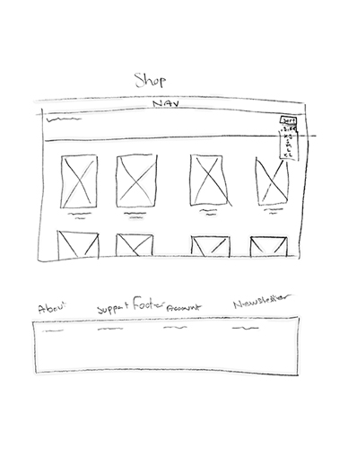
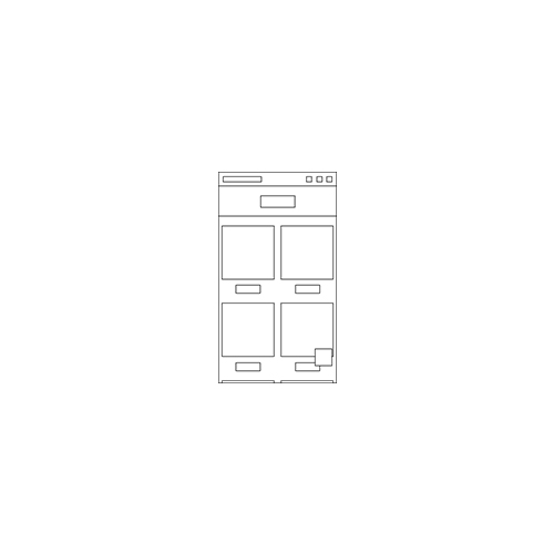
Wireframes:
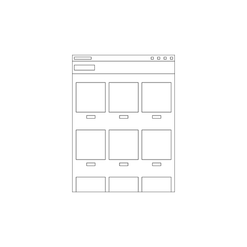
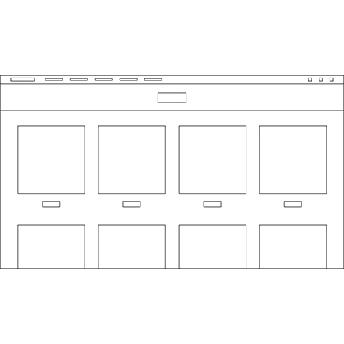
I usually go with the 'mobile-first' rule, but for this web shop I made an exception. That's because I wanted to take on a more creative approach, and since mobile is usually just a simpler version of desktop, I figured it'd be best to make the desktop version first.
Code:
In the example down below, I have shown how I had structured the code for an easier read.
That way, it's a lot easier to spot mistakes, add or remove stuff.
For selectors I had given out a lot of classes, and the elements without classes are still pretty easy to select by mentioning their parent.
I took use of a 12 column grid made in the standard.css.
<!--FRONTPAGE-->
<header class="frontpage">
    <h2 class="sale-fall19">Fall sale</h2>
    <a class="shopnow" href="collections/fall19.html">Shop now</a>
</header>

<!--FRONTPAGE CONTENT-->
<main class="frontpage clearfix">

    <!--NEW STUFF-->
    <article class="frontpage col12">
        <a href="collections/featured.html">
            <h3 class="frontpage">Check out what's new!</h3>
            <img class="frontpage-banner" src="img/frontpage/new-frontpage-banner.jpg">
        </a>
    </article>

    <!--POPULAR-->
    <article class="frontpage col6">
        <a href="collections/popular.html">
            <h3 class="frontpage">Don't know what to buy?</h3>
            <img class="frontpage-banner" src="img/frontpage/popular-frontpage-banner.jpg">
        </a>
    </article>

    <!--BUY A GIFTCARD-->
    <article class="frontpage col6">
        <a href="pages/giftcard.html">
            <img class="frontpage-banner" src="img/frontpage/giftcard-frontpage-banner.jpg">
        </a>
    </article>

</main>
Linking of fonts and stylesheets:
The fonts used are from Google Fonts. And by selecting both of them on Google Fonts, I could link
both of them in my html with a single url.
style.css is linked in the header of the html.
However, the standard.css is linked at the very top of style.css, so standard.css acts as foundation, and can be build upon and/or overwritten in style.css.
html:

<head>
    <link href="css/style.css" rel="stylesheet" type="text/css">
    <link href="https://fonts.googleapis.com/css?family=Oswald:400,600,700|Source+Code+Pro:200,300,400,500,600,700&display=swap" rel="stylesheet">
</head>


css:

@import url(standard.css);

h1,
h2,
h3 {
    font-family: 'Oswald', sans-serif;
}

p,
h4,
a,
address,
input,
textarea,
q,
td {
    font-family: 'Source Code Pro', monospace;
}
Images:
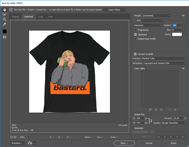
I exported the pictures with File > Export > Save for Web (Legacy)....
They're all saved as .jpg and are limited to be max. 100K in file size for minimized loading times.
