Main Course 1

Graphics & Image Processing

Typography

Graphic Design

Graphic Production Apprehension

Foreground:

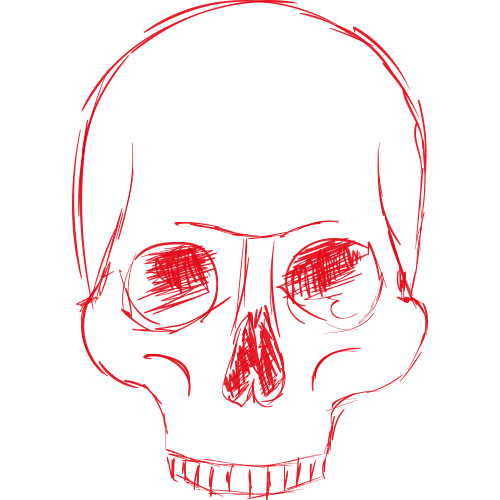
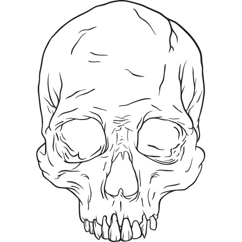
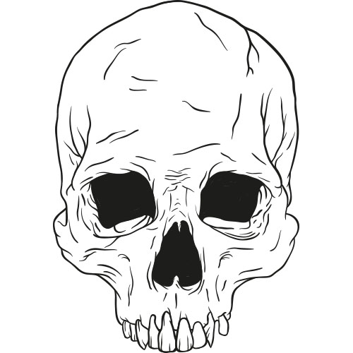
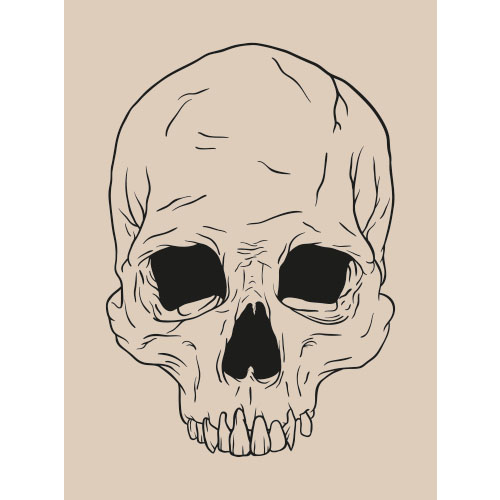
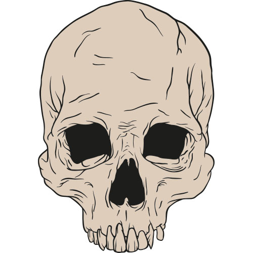
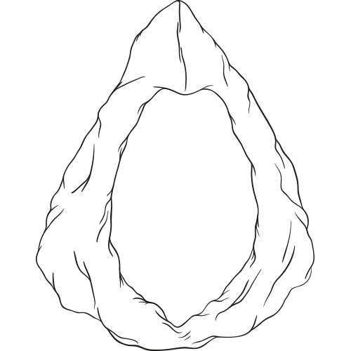
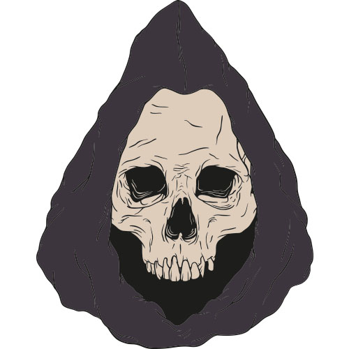
The skull was made from a rough sketch, then a cleaner sketch, a drawing and black fill in the nose and eyes. After applying the base color to the skull, I've drawn shades in two separate layers, with the darkest in the front. I didn't sketch the hood, because its structure was very random yet simple. I've made only one layer for the hood's shading, because it's not needed and the skull is the main focus. For the final adjustments, I made the colors in the hood blend in with the background, and I drew some lines in the nose and eyes, colored with a gradient consisting of the darkest shade and black.

Background:

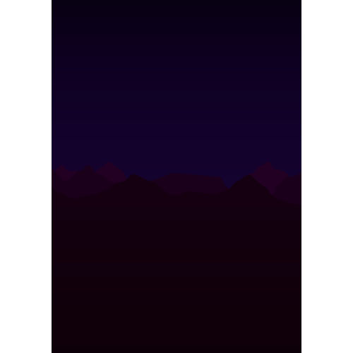
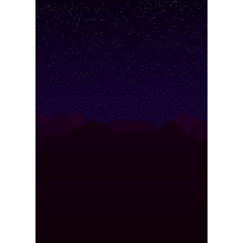
The background was made with a gradient as the sky, three mountains with the darkest in the front, and some stars made with a custom scatter brush. The mountains are the only thing I'd done with pentool, because they're just mountain-like shapes with no strokes. There's a gradient layer mask on top of the stars to make them fade out in the bottom.

Repent:

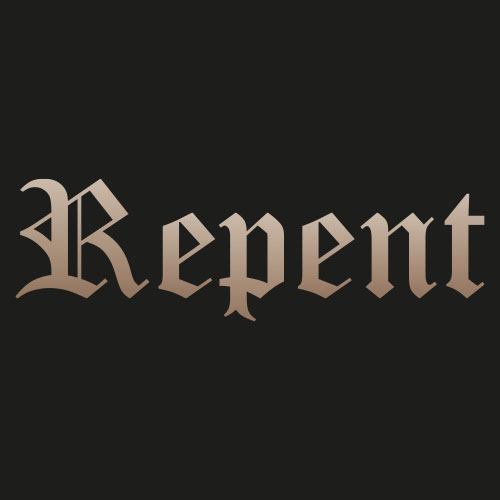
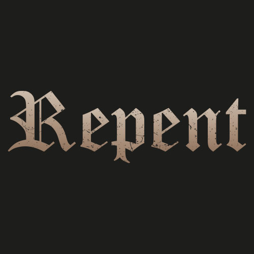
My choice of font is Old English, a classic, which I think fits perfectly for the raw and sombre. The texture is a layer mask so it only affects the text, and you can see through the scratches. I used the base color and darkest shade of the skull, as a gradient for the text. I felt like 'Repent' was the right thing to write, because it really expresses that someone has done something so horrible, they ended up in front of Death himself.

Colors:

I've check marked 'Global' in my swatches, to be able to easily change/adjust a color for all of its elements.
C:15 M:20 Y:27 K:0
C:25 M:33 Y:39 K:0
C:45 M:52 Y:62 K:0
C:87 M:85 Y:71 K:40
C:95 M:92 Y:81 K:50
C:75 M:100 Y:0 K:85
C:75 M:100 Y:0 K:90
C:100 M:100 Y:74 K:0
C:0 M:0 Y:0 K:100
C:0 M:0 Y:0 K:0

Image Extration:

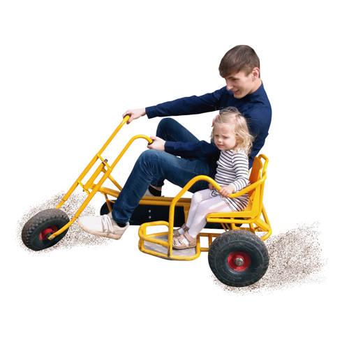
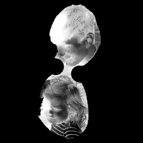
I started tracing a path with the pentool around the extraction, and then I had to trace the holes inside the shape. Once I had made my final shape and saved it, I made a pixel selection of it and feathered it 0.5 px before turning it into a layer mask.
To give the hair a smooth transition, I duplicated the original with the clearest contrast between background and hair through the channels panel. With the use of dodge- and burn tool I made the hair white and background black, leaving a slightly grey edge for a smooth transition.

Dirt:

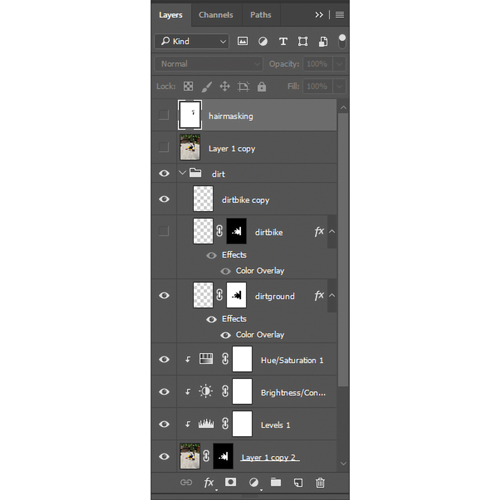
I painted the dirt in with a custom brush that consisted of scatter, angle-, roundness-, size- and opacity jitter. I colored the dirt with color overlay in layer style, so it would be easier to change if needed.
By copying the dirt layer, rasterizing its layer style and setting the blending option to overlay, I made the parts covering the wheels and shoes look more realistic.

Merging:

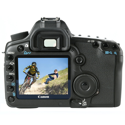
I grouped the extraction and applied a layer mask. I made myself able to move around my content and always have it hide the part where the grass is, by tracing the grass in the group's layer mask.
I adjusted the lighting and colors of the extraction with hue/saturation, brightness/contrast and levels. I also added some gaussian blur to match the field of view, and noise to make it more photo realistic.