Inspiration and brainstorm:
The customer came up with a lot of ideas for content, colors and fonts to use. Since I can't just make something of 'being awake', the expression was also reviewed.





Sketches
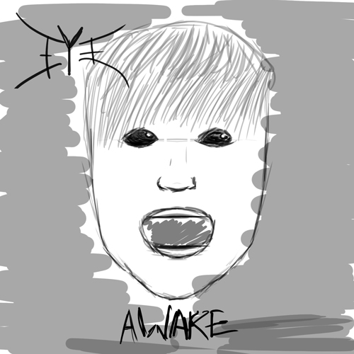
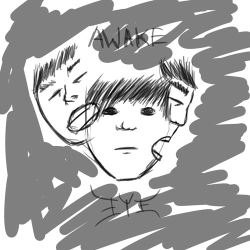
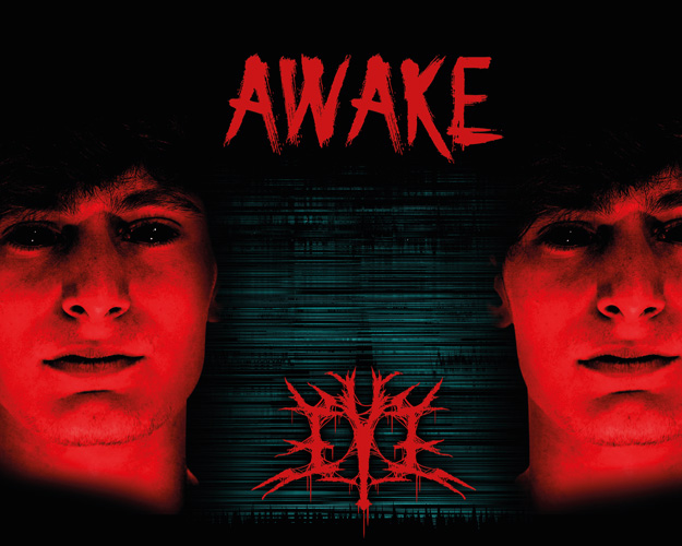
After the first meeting with the customer, I could start sketching. The album was described with keywords such as gloomy, dark, insomnia, paranoia. I felt like a face expressing those things fits the description. And the black eyes, aka. 'devil eyes', to weight towards the dark and gloomy.
Colors:
The customer's colors of choice were red and black. The blue color comes from the red, as I inverted it in the glitch effects. I picked out a darker red because it looks so good with the black. The customer approved.
Font:
I used 'Evil Dead' as the font. It's a display font that looks like a sans-serif, with discreet serifs in various places. It reminds me a bit of Copperplate. Even though it's a display font, it's easy to read and looks good with the logo.
Cerebration of elements:
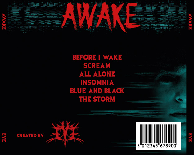
Every element has a thread of consistency. The glitch effect is the glue to it all, one could say. Besides creating some contrast to the red, it also fills out a lot of space, without making it sound like it was just dumped in there. The red elements are clearly the primary elements, because it's the primary color and creates more contrast than the blue does. I've made sure the red and blue colors are in harmony. It can be seen especially on the back of the cover, where the face is blue, and the album title, song list and logo pops out with a clear contrast.
Finished product:
Front of CD case:

Back of CD case & sides:
Inside of front:

Inside of back:
CD:

| Front: | 120 × 120 mm |
| Back: | 138 × 117.5 mm |
| Spine: | 6 × 117.5 mm |
| CD: | 118 × 118 mm, hole: 38 × 38 mm |
There's a 3 mm bleed on everything, except the CD. There's a good connection to it all, and it looks aesthetically pleasing when using the product. The front is the most noticable thing about the case. When you open it, their logo stands out to the left of the CD, which creates a balances between promotion of the band and album. The artwork of the inside of the back is moved slightly to the right, so it looks the same with or without the CD.